Str. Kossuth Lajos Nr. 208/C
Gheorgheni, Jud. Harghita
Mobil: 0748-678.369; 0748-146.596
0756-168.490
E-mail: nektarking@gmail.com
Echipamente apicole | Despre noi | Produse apicole | Evenimente | Colaboratori | Galerie foto | Contact


Str. Kossuth Lajos Nr. 208/C
Gheorgheni, Jud. Harghita
Mobil: 0748-678.369; 0748-146.596
0756-168.490
E-mail: nektarking@gmail.com
Echipamente apicole | Despre noi | Produse apicole | Evenimente | Colaboratori | Galerie foto | Contact
miercuri, 23 iunie 2010
Ambalaje pentru miere
Ceea ce este important de stiut (pentru necunoscatori) este ca 99% din ambalajele de sticla folosite in industria alimentara sunt aduse din import. La noi in tara nu se mai fabrica borcane si sticla, iar daca se fabrica pe undeva este foarte posibil ca nu la standardele cerute de legislatia in domeniul alimentar.
Fiindca multi apicultori sufera din cauza lipsei de informatii m-am gandit sa-i ajut punandu-le la dispozitie datele de contact ale firmelor pe care eu le cunosc care comercializeaza diferite ambalaje de sticla sau plastic pentru miere sau alte produse apicole:
1) Perpetuum Ambalaje -Cluj, www.borcane.ro, au o gama foarte larga de borcane si capace pentru miere de la 30g pana la 720ml, inclusiv borcane cu model hexagonal.
2) Emporion - Bucuresti, www.emporion.ro, au o gama de ambalaje mai deosebite borcane si sticle cu design special. Pentru cei care fac diferite bauturi pe baza de miere, si nu numai la ei gasiti sticle cu design special.
3) Angelis - Bucuresti, www.angelis.ro, si la ei gasiti o mare varietate de borcane de sticla la preturi de importator.
4) Pentru diferite ambalaje de plastic (borcane sau caserole micute de 20g) puteti sa contactati firma Melifera de la Timisoara, tel: 0256 418723, email: stoianov.spasa@gmail.com
5) O gama foarte larga de ambalaje pentru miere de tip: flacoane, ursuleti si borcane pentru miere din ambalaj plastic gasiti la firma NEKTAR KING - Harghita, www.nektarking.ro. Tot aici gasiti si ambalaje speciale de carton de tip cutii pentru cadouri cu miere, betisoare de lemn pentru miere, precum si cea mai larga gama de utilaje si echipament apicol necesare unui stupar.
Cei de la Nektar King practic sunt importatorul nr. 1 pentru echipamente si produse apicole, fiindca au cea mai larga gama de utilaje, iar din punct de vedere al modului de prezentare a produselor au nota 10 din partea mea, fiindca au un site cu toate pozele si preturile produselor, mereu updatat la zi. Felicitarile mele!!!
Daca dintre voi cei care va ocupati de apicultura mai stiti si alte firme care au ambalaje pentru miere (nu echipament apicol, pentru ca aceea e cu totul alta ramura), va rog frumos spuneti-le aici,pentru ca si alti apicultori sa beneficieze de aceste informatii.
Eu una nu prea inteleg "secretomania" apicultorilor, care evita sa-si dea informatii unii altora de teama sa nu li se fure ideile. Totul in lumea asta se fura, nimic nu-i nou, depinde doar de fiecare in parte cum anume stie sa foloseasca informatiile/ocaziile care i se ivesc in viata.
Ceea ce mi-a placut cel mai mult la tatal meu a fost faptul ca nu a incetat niciodata sa fie profesor, adica sa fie o sursa de inspiratie si de informatii pentru ceilalti din jur. Cu el stii intotdeauna unde stai, si primesti un raspuns clar si obiectiv la orice intrebare, chiar si un "nu stiu" atunci cand domeniul il depaseste.
Pentru apicultorii care il cunosc de multi ani, a devenit un obicei ca atunci cand vor sa se apuce de ceva si nu prea stiu cum sa procedeze vin sa se consulte cu el.
Asta e o mentalitate deosebita: sa fii deschis sa-i ajuti pe ceilalti. Nu castigi nimic in plus daca pastrezi "secrete" modalitatea de lucru, sau furnizorii, sau oamenii cu care ai lucrat. Din contra: pierzi...pierzi respectul persoanei care a apelat la ajutorul tau. E ceva ce nu mai poti repara niciodata, iar cel in cauza tot va afla pana la urma ceea ce-si doreste din alta parte.
Pe principiul "informatia inseamna putere", multi considera ca trebuie sa pastreze tot ce stiu doar pentru ei. Gresit: puterea vine din relatiile pe care ti le stabilesti cu oamenii carora le impartasesti de-a lungul timpului informatii folositoare. Respectul si recunostinta lor e cu adevarat o putere!!!
Deci, dragi apicultori si procesatori de miere, nu ezitati sa va impartasiti experienta si cunostiintele. Fiecare dintre noi are la un moment dat nevoie de ajutor de la altii, si uneori veti fi chiar d-voastra cei in cauza, si veti dori sa gasiti cat mai multe "usi deschise".
Publicat de Honey Queen la 01:00

Etichete: ambalaje, ambalaje plastic, apicultori, borcane sticla, diverse, echipamente apicole, miere de albine
http://despremiere.blogspot.dk/2010/...tru-miere.html
25 Beautiful Honey Packaging Designs Inspiration Posted by yesta desamba on June 20, 2013 No Comment
It has been a while since we last showcased design related packaging on Jayce-o. Today, we like to showcase 25 Honey Packaging Designs to inspire you.
"Honey gathering activities allegedly been going on since 10,000 years ago. At first, people over use honey as food. Now not only the use of honey as a sweetener but also as a source for energy, to heal wounds, as antibiotics, and even therapy."When entering a department store, you will find a lot of honey products that line, as well as striking. They dominate other similar products. Dominance is used as a strategy to strengthen the marketing of consumer awareness of a product. This powerful and accurate manner; Consumers will determine one of the best honey products (for quantity), and they will feel that the product is an alternative to the usual products they use.
Packaging Design related articles:
- 25 Fresh Bottle Designs for Your Inspiration
- 40 Awesome Coffee Packaging Designs Inspiration
- 25 Creative Examples of Paper Cup Designs
- 40 Juicy Jam Packaging Designs Inspiration
- 10 Awesome Vintage Packaging Designs for Inspiration
It is very likely if it is packaged in attractive way, also has a charming design, especially when it's laid out on the storefront. It's time entrepreneurs and small and medium businesses aware of this important matter. That good and attractive packaging is necessary and crucial if neglected.
In this post I have rounded up 25 Beautiful and Creative Honey Packaging Designs to inspire you! Enjoy.
25 Beautiful Honey Packaging Designs Inspiration
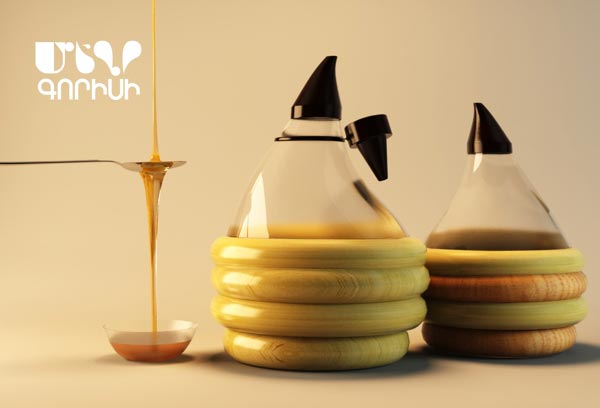
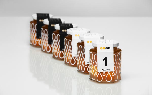
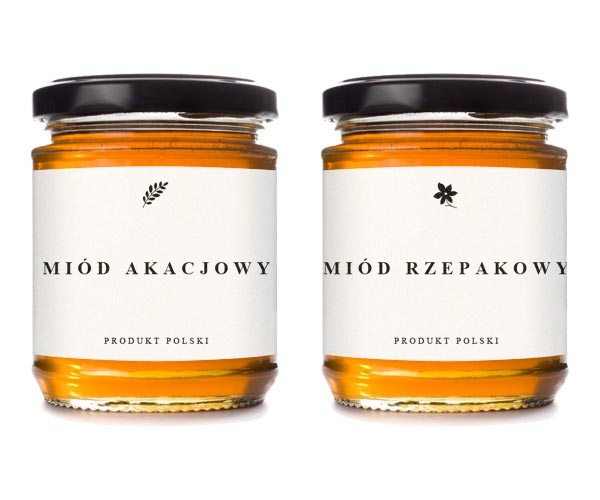
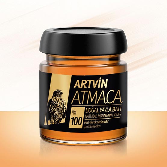
1. Goris Honey Packaging and Label Designed by Lilit Shahbazyan
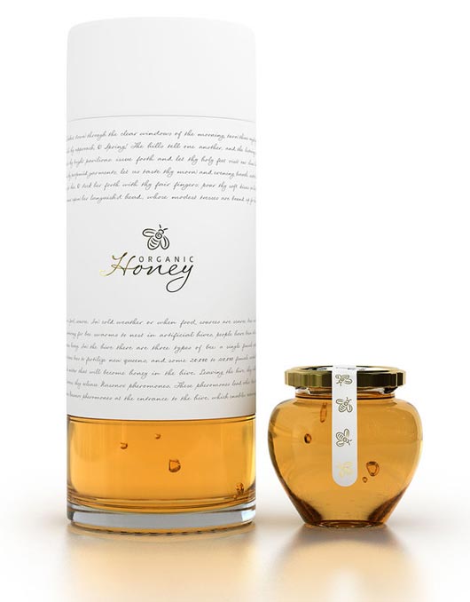
2. Organic Honey packaging concept Designed by Marcel Buerkle
A new and unique way to package honey. A clean, minimalistic logo and branding using a elegant and simple typefaces upon large white space or canvas gives the design a distinctive and sophisticated appeal.
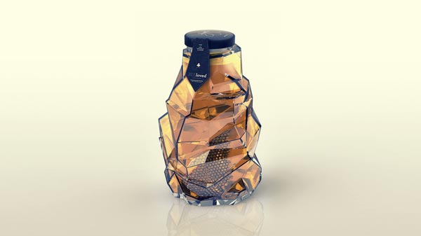
3. BEEloved Honey Packaging Designed by Tamara Mihajlovic
New brand made as a school&personal project.
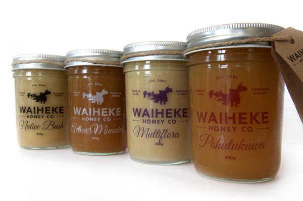
4. WAIHEKE HONEY CO. Honey Packaging Designed by Jason Fantonial
It is a raw honey, unpasterized, unfilterd, unblended and extracted and packed from a single hive to give you an experience of honey the way it naturally should be.
5. Molnár Méhészet Honey Packaging Designed by Krisztina Berta
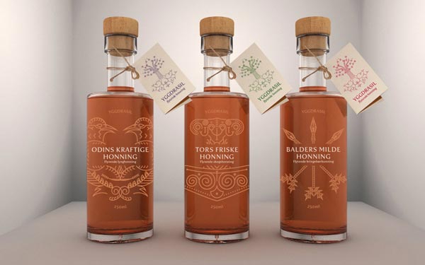
6. Yggdrasil Honey Packaging Designed by Martine Hage
The design is inspired by the histories of the viking gods and norse mythology. It is said that honey drops falls from the leaves of Yggdrasil, the world tree. When the gods held their counsils, they gathered around this tree.
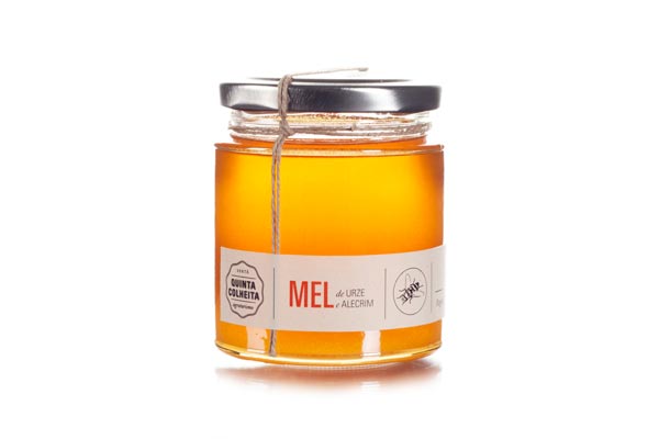
7. Quinta Colheita Honey Packaging Designed by Filipa Serra
Project developed in schools, whose aim was to develop a concept for a fifth and further develop the graphic material disclosure and its package of products produced by the farm.
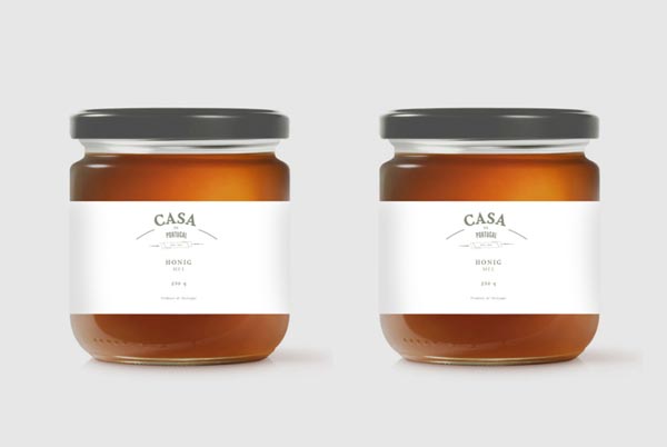
8. Casa De Portugal Honey Packaging Designed by woodlake design studio
An elegant approach for honey packaging.
9. Doce Cielos Honey Packaging Designed by Anagrama
"The packaging design praises the great variety of honey varieties using a categorization based visual system and nomenclature. The typography is meant to convey the cleanliness and elegance of the product."
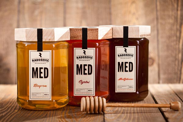
10. Radosevic Family Beekeeping Honey Packaging Designed by Leo Vinkovic
Radosevic Family Beekeeping identity and package.
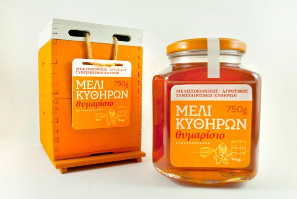
11. Thyme Honey from Kythera Honey Packaging Designed by George Voulgarakis
Promotional package for the Beekeepers' Association of Cythera thyme honey.
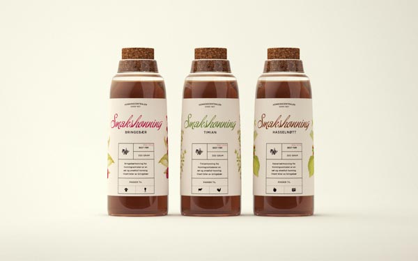
12. Honningcentralens Smakshonning Honey Packaging Designed by Marius Sunde
"Smakshonning is a new range of honey with added flavor from Honningcentralen, Norway's leading honey producer. The idea was to create a chemistry inspired bottle, to emphasize the applicability of honey within gastronomy."
13. Leśna Pasieka Honey Packaging Designed by Piotr Podgorski
For each type of honey appropriate label was designed, avoiding common bees and honeycomb elements.
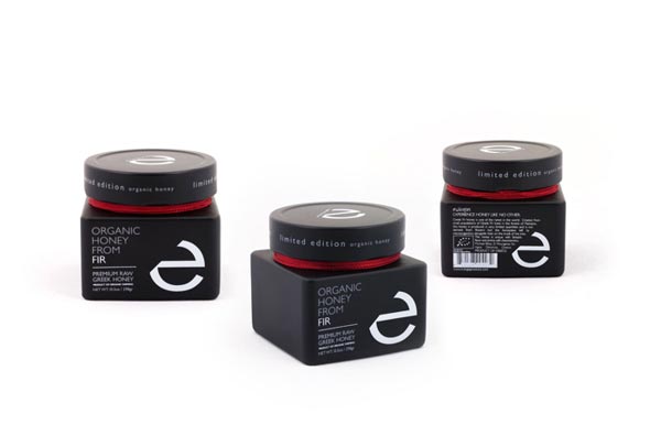
14. HONEY Packaging Designed by Dimitris, PAD
A modern and minimalistic approach for a premium organic honey.
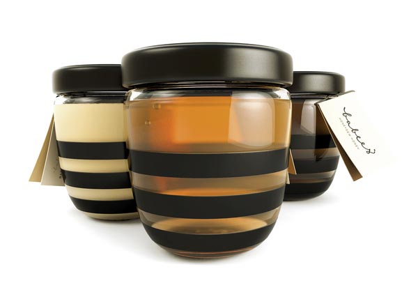
15. Babees Honey Packaging Designed by Ah&Oh Studio
Babees Honey | Honey package design by Ah&Oh Studio.
16. Urban Honey Packaging Designed by Maisie Benson
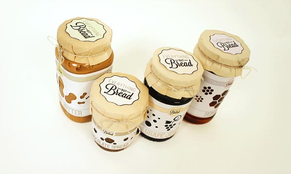
17. Everything but Bread Honey Packaging Designed by Julia Taborskaya
"A set of jars for a fictional brand "Everything but Bread". The set includes a jar of honey, jam, peanut butter, and chocolate spread."
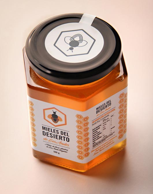
18. Mieles del Desierto Honey Packaging Designed by Juanjo Marnetti
The aim of this pack is to highlight the quality and nature of the product. That's why the most relevant of the label, is the plot of the honeycomb.
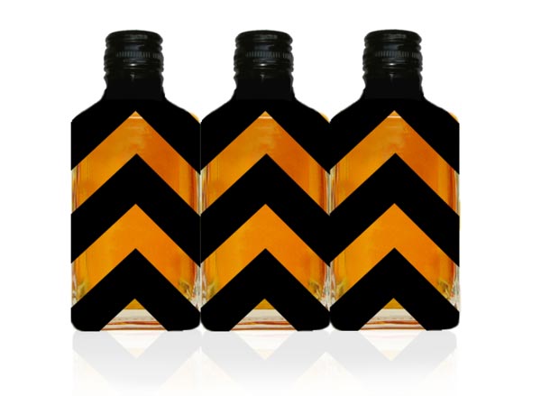
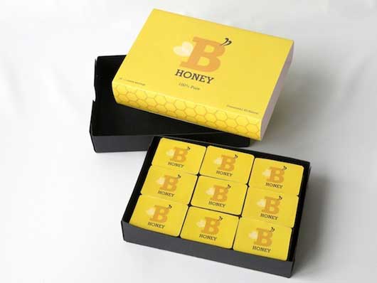
19. B Honey Packaging Designed by Gavin Thompson
"A printed sleeve/box with 18 individual honey containers inside. "B Honey" was intended to be a simple and approachable retail product with a child-like appeal."
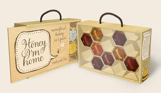
20. Honey, I'm Home Honey Packaging Designed by Alisara Tareekes
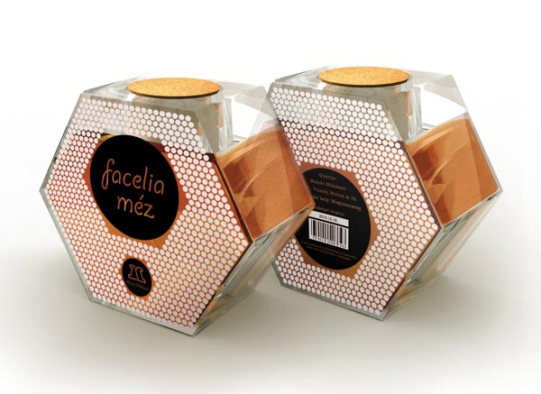
"The shape of the jar is hexagon to mimic the hexagonal honey comb structure. For the gift set, a wooden box is crafted to look like a modern honey frame that is filled with honey in each space. The jars are arranged at random to reflect natures randomness."
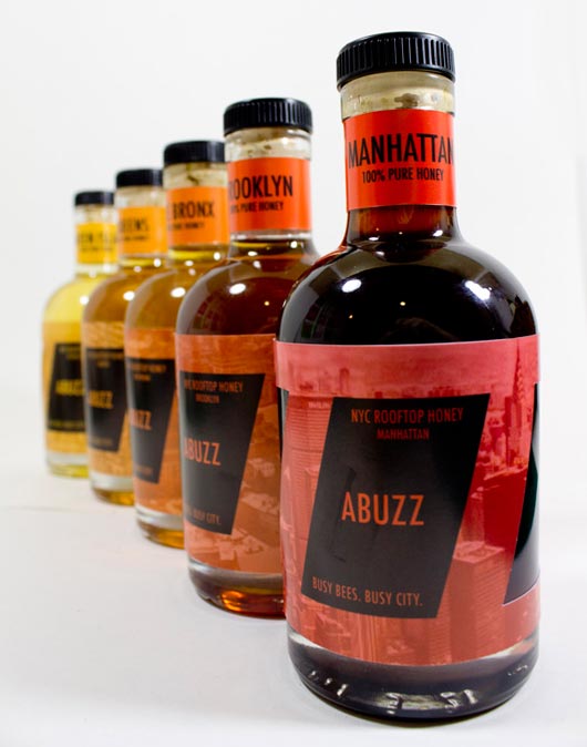
21. ABUZZ: NYC Rooftop Honey Packaging Designed by Andrew July Scott
"Created the ABUZZ brand and packaging concept. Based on the busy nature of bees, especially the one's here in NYC. The images on the labels are aerial views from all five boroughs, from which the honey would originate."
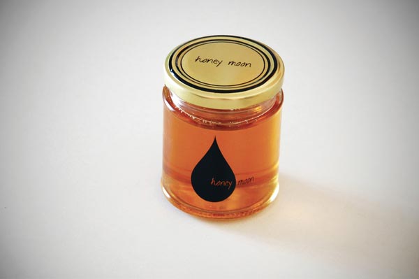
22. honey moon Honey Packaging Designed by Marco Marras
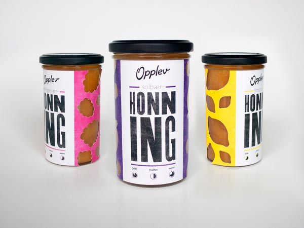
23. Opplev honning Honey Packaging Designed by Jørgen Brynhildsvoll
Fresh packaging for honey product.
24. Honey packaging concepts Designed by Orsi Frey
Honey packaging concepts.
25. Honey Package Design by Ersin Kayabasi
an elegant honey package design.
http://jayce-o.blogspot.com/2013/06/...g-designs.html
25 Fresh Bottle Designs & Bottle Packaging for Your Inspiration
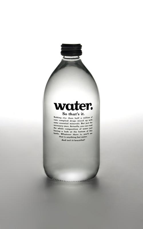
1. Water.
University project consisted on creating a new water brand, concept & design.
As simple as it sounds, Water. sells its product just the way it is, leaving aside the complications. Simple product, simple brand, simple design.
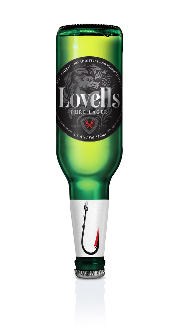
2. Lovells Lager
Lovells Lager was created by two successful Australian music industry professionals, with a passion for great tasting beer.
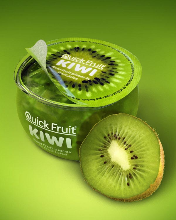
3. Quick Fruit packaging concept
3D visualization renders for Quick Fruit packaging concept.
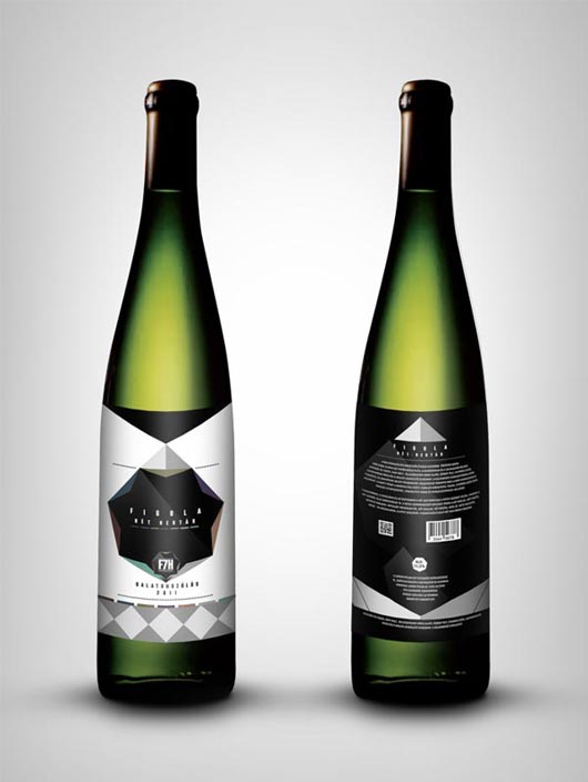
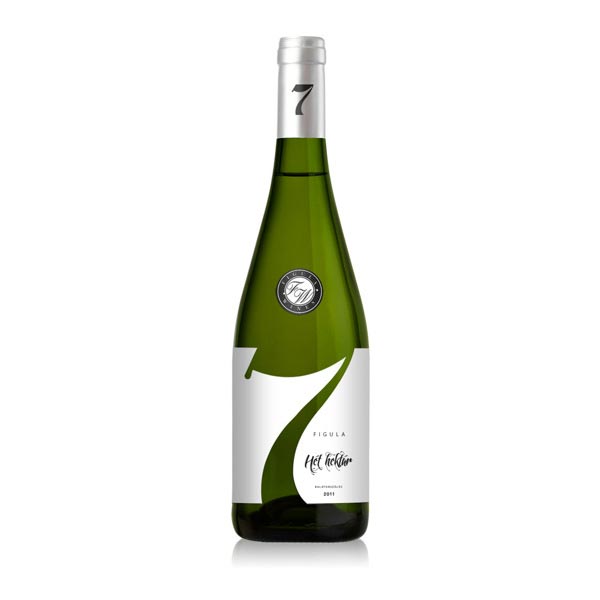
4. Figula Hét Hektár wine label
Figula Hét Hektar (Seven Hectares) design concept.
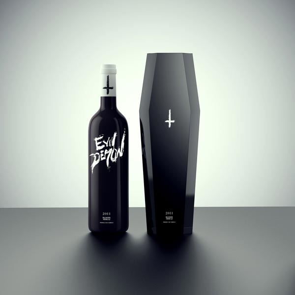
5. Possession - The Unholy Wine Collection
The type design on each bottle reflects it’s theme and was made in a rough way to contrast the otherwise clean setup and design, to give it more of an edgy look. This is a self initialized conceptual design.
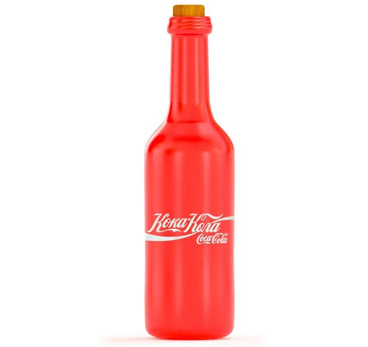
6. Coca-Cola retro label (concept)
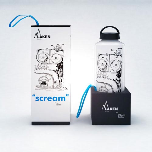
I found once the old label cola. Fantasized a little, tried to imagine how it could look like in the Soviet Union, given the fact that all the packaging was standard. Based on this concept was coined by a modern retro style.7. Laken bottles
Illustrations limited serie and packaging design to Laken bottles by José Parra. All rights reserved by Mister Onüff.
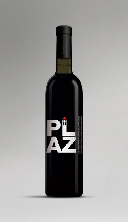
8. PLAZ Packaging Design
As I was assigned to design starting from client's logo, to their packages for various category of products. This quite a long process from marketing brief to the design. PLAZ is a (concept) brand getting from the first alphabet of 4 founders P, L, A, and S. We finally change S to Z to make it more interesting. Hope you like it.9. Figula wine label
Wine label concept.
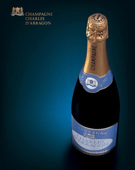
10. Champagne Charles D'Arragon
Charles d' Arragon is a traditionnal French Champagne, with a classic and genuine style. Concept, branding, packaging design and look and feel of the website. For Markcom design.
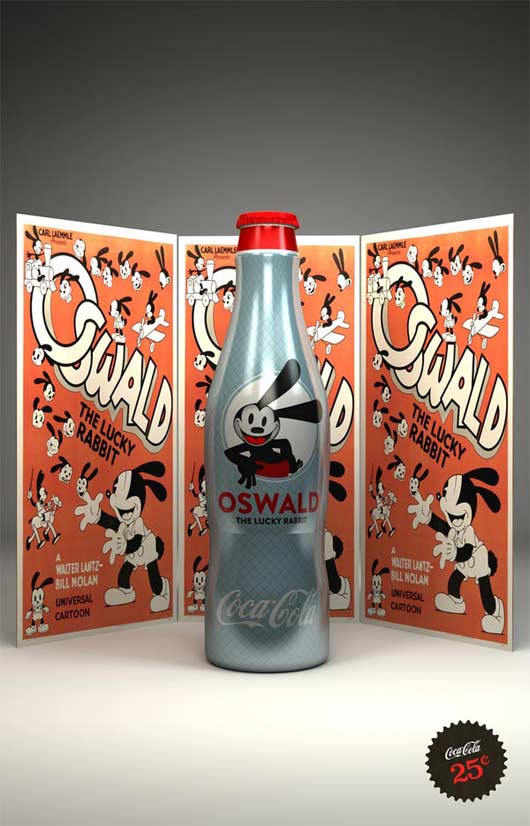
11. Disney Coke Bottles
Created a series of custom Disney themed Coke Cola bottles. Which where to be sold on property at DisneyWorld via an interactive vending machine.
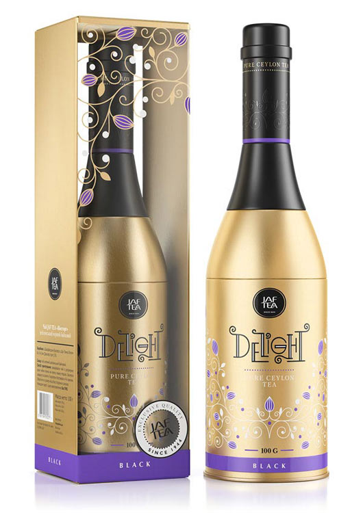
12. Delight
One more tea packaging design for the 'champagne bottle' concept.
Made for the JAF TEA brand from Sri Lanka.
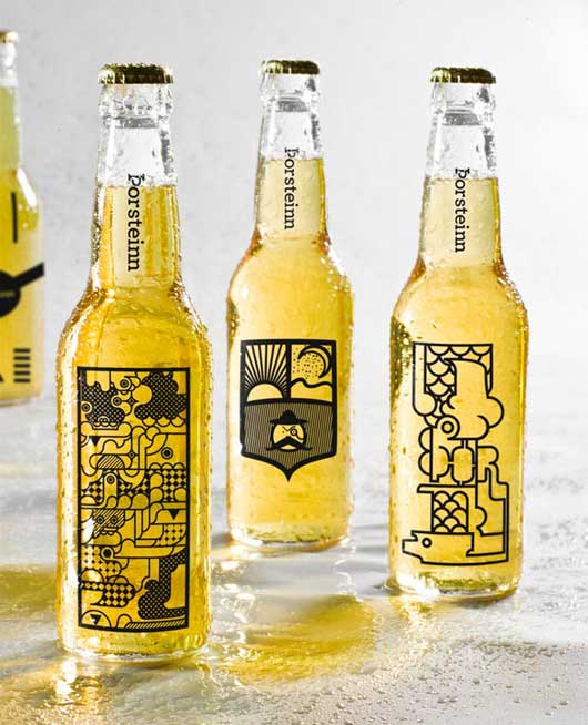
13. Thorsteinn Beer Brand
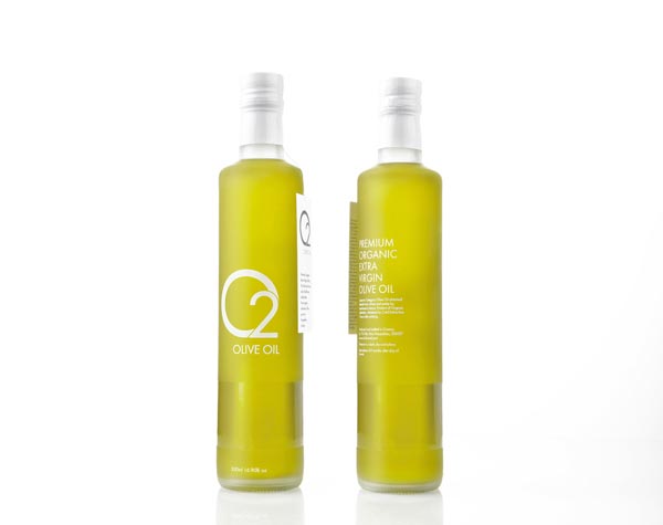
School project at the Iceland Academy of the Arts. We were to make a branding proposal for a microbrewery in Iceland and we decided to make 10 different bottle designs for the one and the same beer brand.The design could be placed on beer glasses as well.14. O2 Olive Oil
For now it is only at a concept stage. Get in touch if you want to invest in our brand for production.
Brand identity and packaging design for a new premium organic Greek extra virgin olive oil. O2 concept, emerged, as a balanced symbiosis of tradition and innovation.
Being dedicated to the proper implementation of our innovative and eco friendly method of production, guarantee that the Olive Oil produced is of organic specification and of ultra low acidity, while preserving the highest amount possible of natural antioxidants.
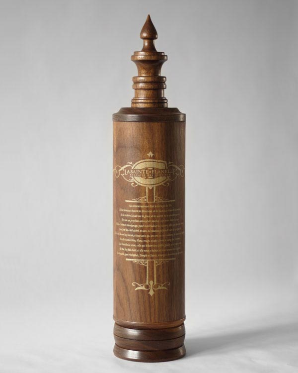
15. La Sainte Flanelle : L'Évangile des Glorieux
Projet réalisé dans le cadre du concours Young Package 2011. The challenge was to identify and packing a national product. The Habs discusses the place of the hockey club of the Montreal Canadiens in the Quebec people. The popularity of the team and its activities is so extreme that it can be compared to a religion. The concept plays with religious iconography and offers the Glorious Gospel, composed of seven guiding principles by which the faithful preaching.
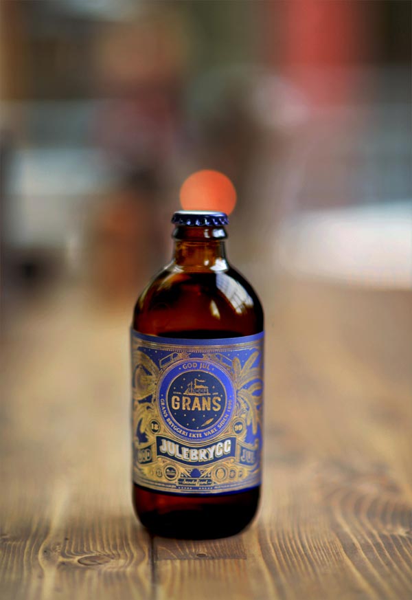
16. GRANS
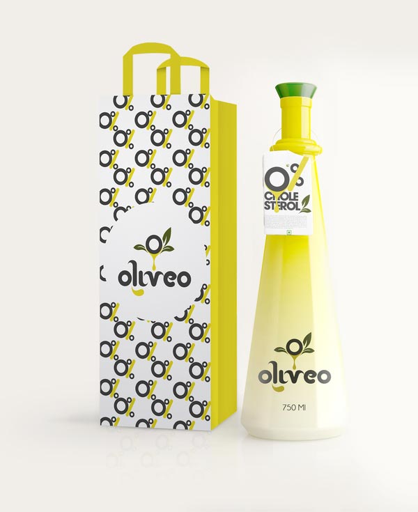
I worked with the Agency FRANK in Oslo, to create this packaging illustration for the Norwegian Brewery Grans. The concept was to bring back the traditional approach of hand drawing from earlier era's for the relaunch of their Christmas beer. The entire label including type was drawn out by hand as one piece.17. Oliveo Olive Oil
Oliveo is a Spanish based Olive Oil Company. The brief given to us was to build a brand identity based on its numerous benefits like non-cholestrol (bad cholestrol), high nutritional values plus they wanted to have an olive in their logo.
18. Point Wells Winery Branding
Concepts for a boutique export-only winery located in the Matakana Wine District of New Zealand. A minimalistic yet striking and bold approach was employed to create a new stand-out brand in a very much crowded marketplace.
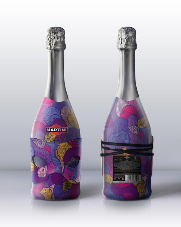
19. Martini Art
the concept of a Christmas package Martini Asti.
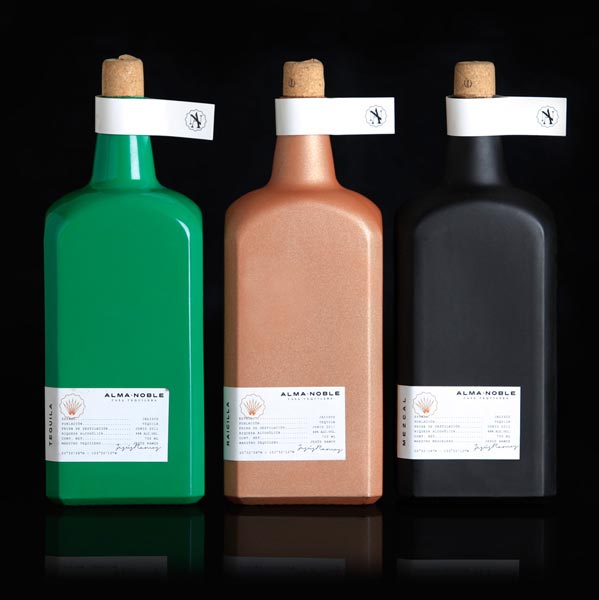
20. Alma Noble
Identity and Packaging design for Siete 50 (Pro Agave) a Mexican Expo that supports products that come from the Agave plant.
The projects idea was to intervene a bottle with a design of your own; but we wanted to kick it further. We created a name for an unexisting Tequila House, then we created the identity and the companymantras. Then we started with the product (bottles), we had 3 of them, but we wanted to make a product family. The final decision was to make "Tequila", "Raicilla" and "Mezcal", these are 3 spirits that come from the Agave plant in different processes. These 3 spirits represent : Heaven, Earth and Hell.21. Food&Life
Concept work. Graphic design of a packaging.
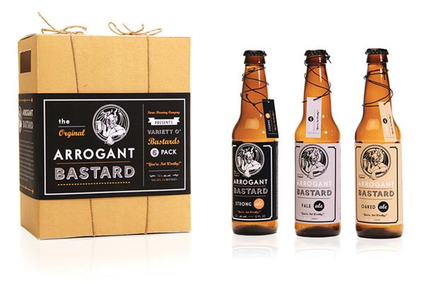
22. Arrogant Bastard
Conceptual repackaging of Arrogant Bastard beer using existing logo. This design was part of The Dieline's top 100 packaging designs of 2011.
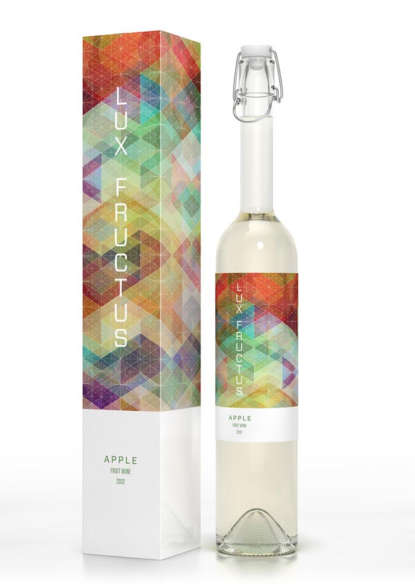
23. CUBEN Space / Lux Fructus: Fruit Wine Packaging
Concept packaging for fruit wine inspired by Simon C Page's wonderful Cuben project. Features patterns design by Simon Page and Marcel Buerkle, visualized on fruit wine packaging.
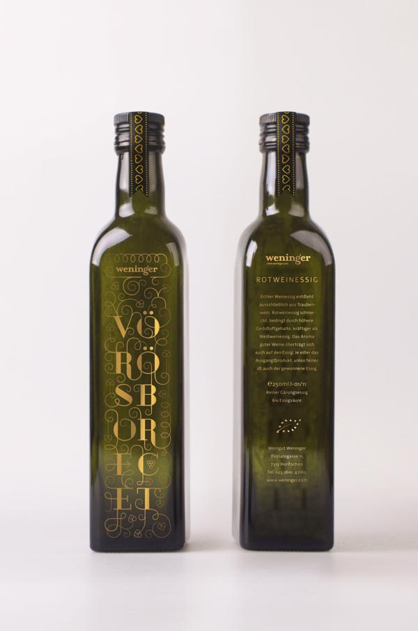
24. Weninger winery premium products package concept
Weninger winery premium products package concept 2012 by Boglárka Nádi
25. off. packaging
"Off." was developed as a concept buttermilk drink (with real vanilla) for Arla Foods in the course of a study. "Off." acts as a counterpart to the oversaturated market and philosophy of energy drinks. Instead of pushing forward “Off.” encourages the opposite, get offline, unplug. Take a little time out and recharge your batteries naturally, with the aid of “Off.”
So which bottle design do you like best? Feel free to share it with us in the comments below.
55 Premium Bottle Designs & Bottle Packaging Inspiration
1. Narancs 2011 - Package design of a self-made marmalade
The Designers decided to make self-made marmalade from orange, lemon and lime. They peeled the fruits for hours, boiled them with sugar, vanilla, and cinnamon. It was so delicious at the end, so it deserved some proper package design.
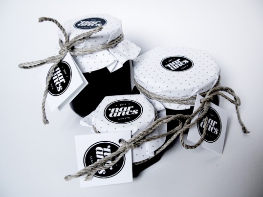
2. Manic’s Merrymaking Must-Haves
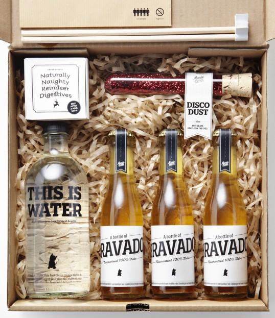
This Packaging holds all of Manic’s secret ingredients for a remarkable Christmas. Consumed correctly, this bundle will produce the most magical effects — eternal youth; a keen nose to guide you to the nearest bar; an outstanding sense of humour; and an insatiable desire to be merry.
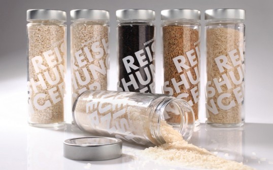
3. Reishunger
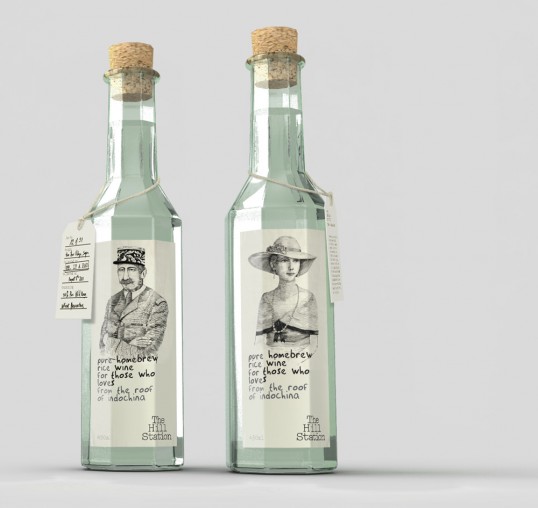
4. The Hill Station
“The Hill Station is a business marriage of fine dining restaurant and deli/boutique, located in Sapa, Vietnam’s highest region. The client wanted a brand which both reminisces the essence of French Indochine days while standing independently as a contemporary identity. The Hill Station products range from fresh produce harvested straight from local farms, limited packaged delicacies such as wild honey, rice wine… to gourmet charcuteries or handmade silverware. At the same time, The Hill Station signature restaurant is a renovated French outpost, with a view from the clouds.
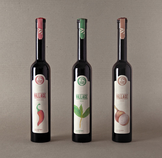
5. Student Work by Luís Oliveira
“Village: a project that was developed in the Graphic Design course at IPCA (Intituto Politécnico do Cávado and Ave) in Portugal, directed by teacher Jorge Pereira.
Village is the gourmet range/brand/variety of Oliveira da Serra’s olive oil. With three types that combine the best extra virgin olive oil with different flavors like Chili, Onion and Mint.
All development of this packaging based on the traditional roots of this product, with special attention to the use of organic production. The organic concept is also represented on the labels from all the three illustrated flavors.”
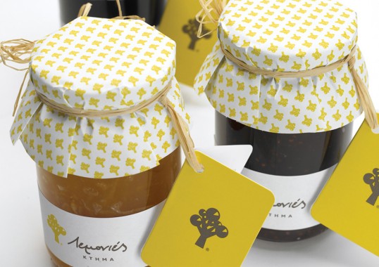
6. Lemonies Estate
“Lemonies estate is an agrotourism unit which is located in the traditional village of Lamyra in Andros island. Its luscious gardens include more than 50 lemon trees, under the shade of which, guests may enjoy their breakfast.
The source of inspiration for the design of the logo which resembles a lemon tree was the ground plan of the estate. The shape of the tree was inspired by the boundaries of the estate, while its fruits correspond to the buildings and facilities of the estate.
The symbol is completed with the addition of a quadrant of the slice of a lemon in each fruit. The handwritten style of the title suggests the anthropocentic character of the project.”
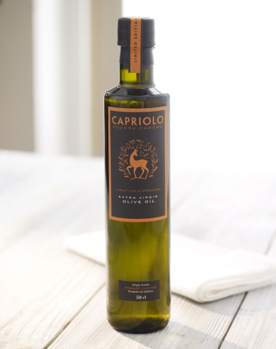
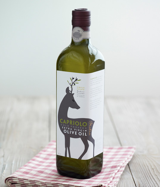
7. Capriolo
In 2009 Family (and friends) created the Capriolo Extra Virgin Olive Oil brand and packaging for the Italian Podere Casone Estate owners in Umbria, primarily to attract UK deli and food store shoppers.
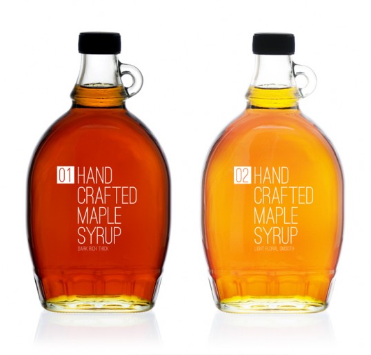
8. Hand Crafted Maple Syrup by TACN Studio
“Maple Syrup comes in different intensity grades, the numbers denote how strong or weak a grade of maple syrup is. The bottle is one typically used to package hand crafted maple syrup yet the typography is modern simple and classic – It’s not a sales pitch, just pure unaltered product.”
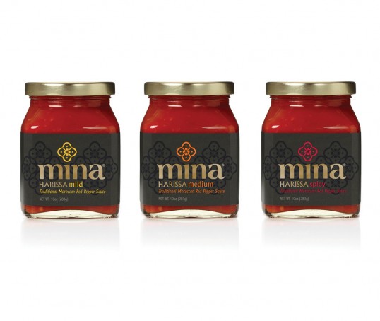
9. Mina Harissa by Monday Collective
Mina Harissa is a new, premium Moroccan red pepper sauce simply made with six natural ingredients (red bell pepper, red chili pepper, garlic, olive oil, vinegar, salt) and comes in three flavors (mild, medium, spicy).
Co-Founder, Fouad Kallamni, came to Monday Collective for a brand design that both differentiates within a crowded category and connects with the taste conscious consumer.
The brand identity simply expresses the culinary culture, provenance and authenticity of Mina Harissa, a sauce hailed as the heart and soul of Moroccan cuisine. The simple brand icon captures the essence of Mina Harissa by using the six ingredients of the sauce within the shape of a red bell pepper when cut in two. Its style reflects patterns and graphics found on traditional Moroccan tiles and textiles. The logo was inspired by Arabic letter forms, expressed with a touch of contemporary style. All of this combined with a color palette of tones of black with a hit of spicy vibrancy gives Mina Harissa a premium, authentic style that sets it apart from the other sauce brands.”
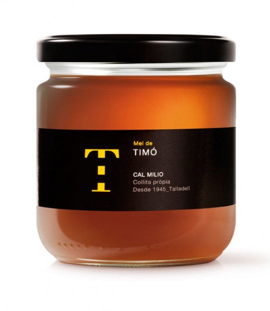
10. Mel de Cal Milio by Puigdemont Roca
A clever and subtle solution for Mel de Cal Milio honey.
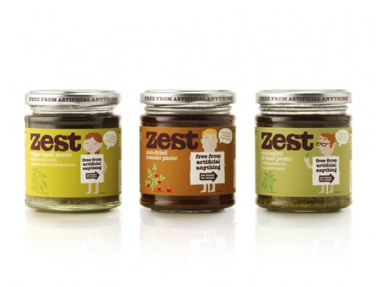
11. Zest by Designers Anonymous
“Zest is an all-natural range of pasta sauces and pestos with nothing to hide.
The packaging range features naive 1950′s style illustrations of male and female naturist characters each proclaiming the ‘free from artificial anything’ message, whilst preserving their modesty with a key ingredient. Each product within the range has a unique character holding a ‘Free from artificial anything’ sign with an arrow containing the words ‘See behind for details’ prompting you to refer to the back of the jar. The characters are found again on the back of the jar, this time displaying the complete list of ingredients, proof that that there is nothing to hide.”
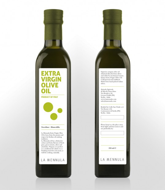
12. La Mennula Extra Virgin Olive Oil by Alessio Avventuroso
“La Mennula Extra Virgin Olive Oil is born from the passion and respect for Sicilian oil-making traditions. We have designed a contemporary brand and a cool label for 250, 500 and 750 ml bottle.”
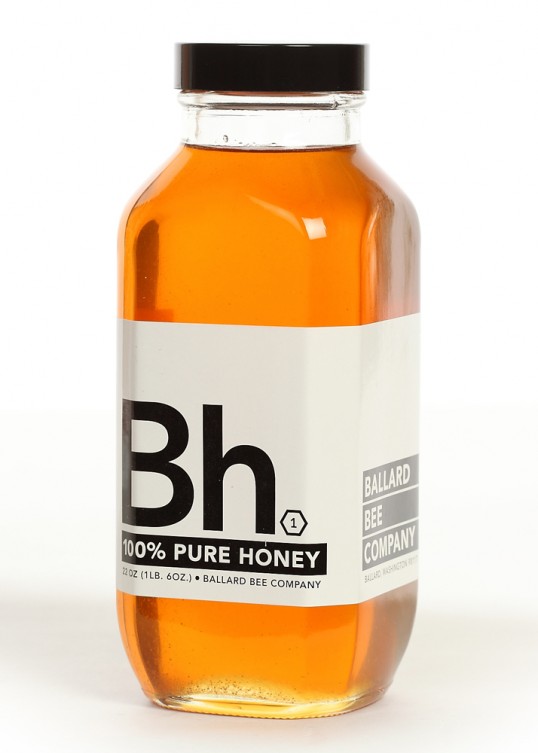
13. Ballard Bee Company by TKTJ Design
“The design is based on the idea of honey being so basic, we created a chemical symbol “Bh” all for itself. The element is a pure chemical substance, that cannot be broken down in further, and by placing this honey within this realm it allows it to take on the idea of honey as purity. The packaging also seems to suggest something medicinal about the product, which is interesting considering honey has long been touted for many other things than just a sweetener.”
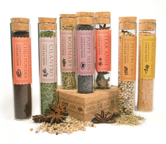
14. Sheffield & Sons Designed by Birdsong Gregory
“To help Bloom Grocery develop a memorable private label for it’s premium angus beef program, birdsong gregory created Sheffield & Sons: a sophisticated but friendly brand that evokes the distinction and personal service of a small friendly neighborhood butcher shop. As part of that campaign, we created this concept for a beautiful line of spices which would exist as part of the labels product offering. The packaging embodies the well crafted and gourmet feel of Sheffield & Sons with its sophisticated palette, illustrative but clean labels, unique material choices, and textures that are relevant to the existing brand.”
15. Olivanica Designed by Toast Design
Family owned & operated Olivanica have been producing small runs of exceptionally fine quality olive oil for a few years with great success. In late 2010, we were approached to create an identity and packaging design to reflect the outstanding quality and purity of the oil.
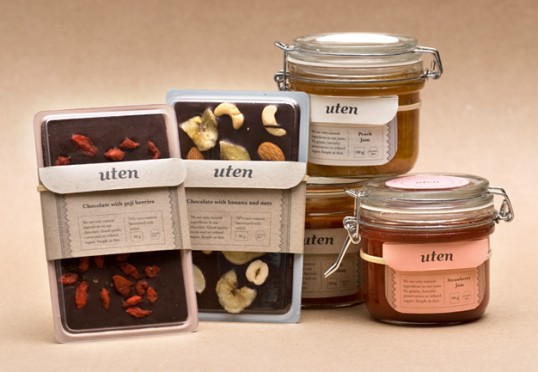
16. Uten Designed by Marcin Rusak Studio
“Uten is a Norwegian product line containing natural and seasonal jams, chocolates and condiments that are home made and free from gluten, milk, soy, refined sugar and preservatives. The packaging encourages the buyer to re-use, with recipes and tips inside the label folder. When the jar is empty and the chocolate is eaten, simply take of the tags (the string makes sure you’ll have no sticky glue marks!) and use the empty containers to create your own delicious foods.”
17. Student Work Designed by Danielle Mitchell
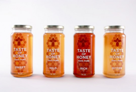
“This project was based on a lyric or song from The Beatles. I choose the song “Taste of Honey” and turned it into a honey brand. To showcase the variety of flavors in an elegant way, I designed a minimal type treatment and paired it with a honey comb pattern. The elements of the honey comb pattern also make the the bee and flower icons shown throughout the packaging and recipe cards.”
18. Alboredes Designed by Ignasi Boza
“Packaging of three bottles of olive oil monovarietales. Each of them identified with a natural element of the environment where the olive trees grow: Bark, land and stones.
The origin and characteristics of the monovariety olive oil gives meaning to the idea of sustainability of natural and historical heritage, which until recently seemed doomed to disappear or be scattered through the gardens and squares Europe, and now you can enjoy a top quality product and warranty, especially for all lovers of equity and sustainability. Three diferent flavous of diferent olive tree varieties.”
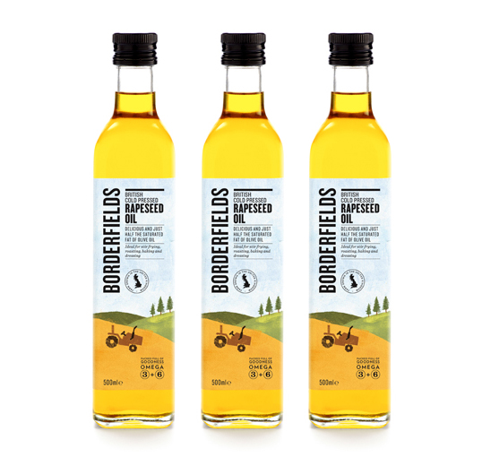
19. Borderfields Designed by Cubic
“Borderfields had been around a while, but sales were flagging. Our task was to breathe new life into the brand, and drum up some more interest in the supermarkets. We created a fresh new colour palette, together with a series of feel-good illustrations, to reflect a feeling of innocent, approachable charm.”
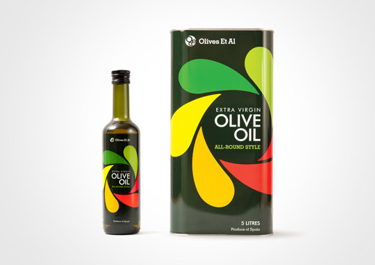
20. OEA Olive Oil Designed by Salad Creative
Colourful, fun packaging for Dorset-based Olives Et Al olive oil.
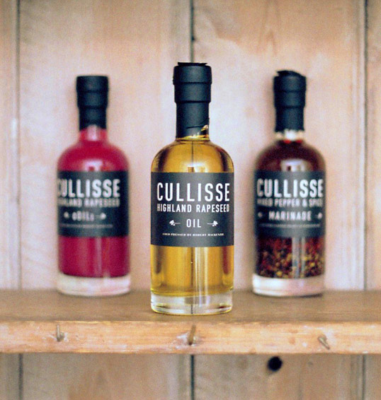
21. Student Work Designed by Freddy Taylor
“Cullisse (meaning nook of the garden) is a brand new rapeseed oil from the highlands of Scotland. Gently cold pressed from seed grown by the Mackenzies of Cullisse on their farm, the rapeseed is then hand-bottled by Robert MacKenzie, one of the fourth generation to produce food at Cullisse.
Concept: Whilst avoiding Scottish clichés, try to create a contemporary brand that reflects the tradition and quality of Cullisse rapeseed oil, through hand-blown, glass bottles and unembellished typography.”
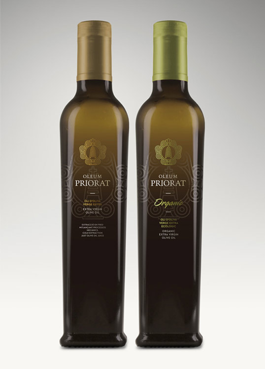
22. Oleum Priorat Designed by Atipus
“From the union of several small producers in the Priorat region, come these high quality oils. The graphics are meant to emphasize the ecclesiastical character of this area and enhance the exclusiveness of the product.”
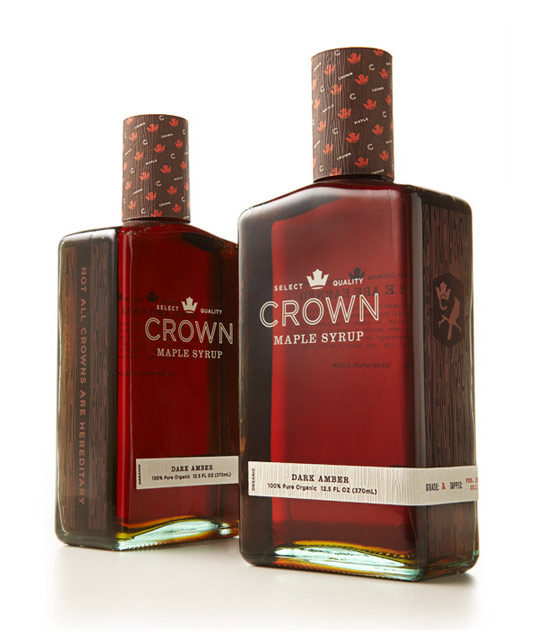
23. Crown Maple Syrup Designed by Studio MPLS
“Studio MPLS created a distinctive brand identity and visual brand language for the world’s first brand of super-premium maple syrup. Evoking the natural elements that abound in the majestic stands of Crown Maple sugar maples, the brand communicates the fusion of natural goodness of the real maple syrup and the sophisticated state of art production techniques that make it the purest maple syrup on earth. Graphic iconography influenced concept package design, secondary packaging, and collateral.”
24. Student Work Designed by Andreu Zaragoza
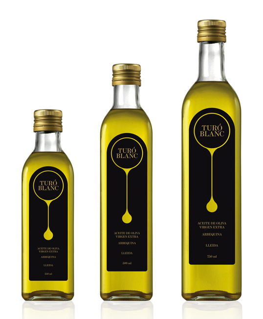
“This project consisted of designs for two different types of olive oil from Turó Blanc. One is a limited production, ecological olive oil and the other is an industrial produced product that will be sold in supermarkets.”
25.B Honey Designed by Pereira & O’Dell
“B, The Honey Cachaça stinger, co-founded by Formula 1 driver Nelson Piquet Jr. and friends, hit the market this month in Brazil. The visual identity and branding of the rum was created by the U.S. office Pereira & O’Dell and Rio 6D agency was responsible for web and print part of the brand.
“B” is made with sugar from the region of Brazil and refined to create a perfect blend of sweet and citrus, adding honey, lemon and generous doses of sophistication, from the recipe to the packaging. Thus, we transform a simple drink a remarkable ‘sting shot’.
26. Ancient Trees Olive Oil Designed by Ignasi Boza
“Traiguera is rich with olive groves, some of them planted during the classical and medieval periods. Since it was a walled village, Traiguera has seen its culture and history reflected in the stones of the August Route which circulates across fields of monumental olive trees. 300 examples the trees have been found where the passing of time has influenced these living monuments. In Traiguera many olive trees have a trunk diameter of 7 or 8 meters, but one of them stands out with a diameter of 10,20 meters, which makes it the biggest olive tree in the entire territory.”
27. La Saracina Oil Designed by H-57 Creative Station
“Packaging for an Italian extra virgin olive oil. La Saracina is a super-limited edition, high-level, top-price product. Besides, olive oil is a tremendously serious thing in Italy. So the packaging had to be the right compromise between elegance and warmth/tradition.”
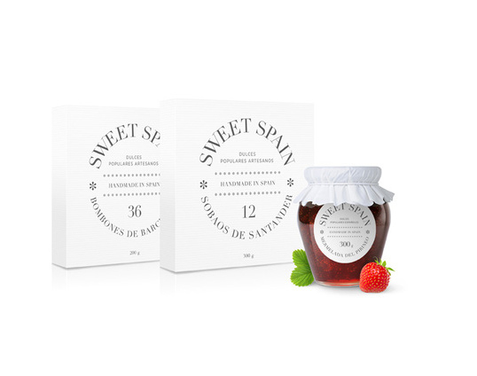
28. Sweet Spain Designed by Pau Puig
“Sweet Spain is a Spanish company that produces typical sweets native to Spain. The packaging is based on a modular system for the entire line giving it a modern yet traditional feeling.”
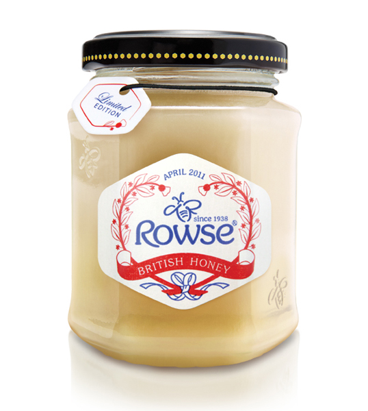
29. Rowse Designed by BrandOpus
“To celebrate the royal wedding and meet the demand for brands marking British nostalgia and the best of British, award-winning design agency, BrandOpus has created a special limited edition pack for Rowse. The celebratory design will hit the shelves at the beginning of April and will be available for a month beyond the event. BrandOpus was tasked with creating a bespoke label for Rowse Limited Edition Royal Wedding British Honey that will be available in major supermarkets such as Morrisons and Tesco. The new iconic packaging features a heart-shaped crest at the centre incorporating devices like the thistle and the shamrock that celebrate the honey brand’s long-established British heritage and quality dating back to 1938. Founder Tony Rowse started beekeeping in a small shed in Ewelme, Oxfordshire before turning his passion into a business. From humble beginnings the company has grown to become the country’s market leader in honey for which BrandOpus overhauled its identity and packaging last year.
Paul Taylor, creative director, BrandOpus says: “Royal wedding fever is definitely upon us and major British brands are capitalising on the feel good factor that the event invokes in the population’s psyche. For brands whose core values include Britishness this is surely the ultimate opportunity to reiterate their British origins.”
30. Sir Kensington’s Gourmet Scooping Ketchup Designed by Alvin Diec & Scott Norton
“We’re excited to say that we’ve released the next version Sir Kensington’s Gourmet Scooping Ketchup, which are 1.5oz miniature jars evoking the same aesthetic as the larger ones. Our intention was to create a compelling option for premium hotels, restaurants, and caterers to offer their customers in single-serve sizes. Though this exists in jams, jellies, and mustards, we simply didn’t think it existed with ketchup.”
31. Student Work Designed by Sarah Rouse-Higgins
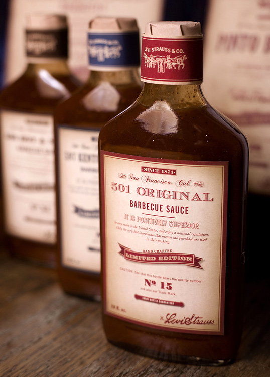
“The Levi Strauss Barbecue Sauce Project was an ode to the roots of the company. Before taking off with denim, they also sold dry goods. I used gold rush era advertisements as the inspiration for the labels. It was important to maintain the look of the company during that time while re-marketing it for a limited edition line of barbecue sauce.”
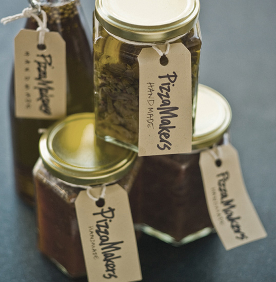
32. The Pizza Makers Designed by Smith & Milton
“How do you communicate ‘just made’ fresh pizza? Everyone thinks a ‘pizza to go’ is going to arrive as a hot, rich cheesy feast (reality: warm, greasy, disappointment). The Pizza Makers have turned the problem on its head and only MAKE pizza. It’s fresh from their kitchens, so it can be delivered (or you pick up) to bake at your convenience.
They needed a brand idea to set the tone for all their communications. First a name that tells the story. And a strapline that completes it. Second, a store refit to bring the kitchen upstairs and into the shop window – people making pizzas is a great advertisement. Thirdly, a blackboard black and white, fresh everyday style to reflect it with the handmade quality of the process. The only colour online is the photography, and instore, of the excellent product itself.”
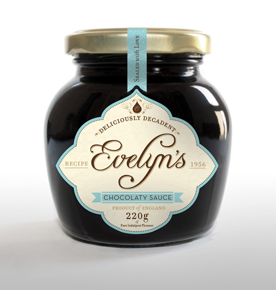
33. Evelyn’s Chocolate Sauce Designed by Jansen Harris
“Evelyn’s chocolate sauce recipe has secretly passed from one Evelyn woman to the next over several generations. This sense of heritage and handcrafted quality inspired the creation of the identity and influenced the design to elevate chocolate sauce to a position of being a personal, almost everyday luxury. Rich and chocolaty, this indulgent pleasure is the perfect desert for any dinner party. We were asked to strategically position, create an identity and design packaging for this decadent new brand.”
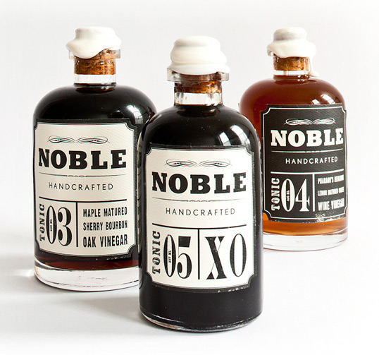
34. Noble Handcrafted Designed by Heather Nguyen
“Nobel Handcrafted is a brand that embraces the collaboration of craft with the pioneering of our new American food tradition, a tradition that is being continually refined.”
35. Mas de Santa Creu Designed by Ambar Partners
“Project: The object of the project was to design an ecological olive oil produced by “Mas de Santa Creu” in the area of Siurana, Catalunya. The family produced an extremely high quality olive oil for their own consumption and decided it was time to commercialize it in very small quantities per year. The olive oil is produced using only ecological methods. It is extracted from olives collected only from the tree, discarding all the fruits that fall to the ground. It is a premium oil and it is sold unfiltered to preserve all its flavors and richness.
Solution: We wanted the label to communicate the strong emotional bond between the family and the land without losing the simple and honest feel of the product. To achieve this we associated the brand to a vintage looking photography that explained the intimate relation of the producer and the family estate in a simple, classical way. At the same time, the typography used in the name (“Oli”)remains clear and simple, thus adding a stylish touch to a very traditional product. The roughness and the homemade character of the unfiltered oil combined with the clean modern looks of the label produces an interesting contrast achieving strong visual presence remaining true to the nature of the product.”
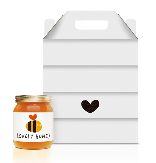
36. Lovely Honey Designed by Jamie Nash
Design and illustration for Lovely Honey. The identity uses a heart motif to reference both the name of the product and also the natural health benefits associated with honey. A limited colour palette and hand drawn style helps create a simple, natural feel. The heart motif continues throughout across items such as secondary packaging and illustrations.”
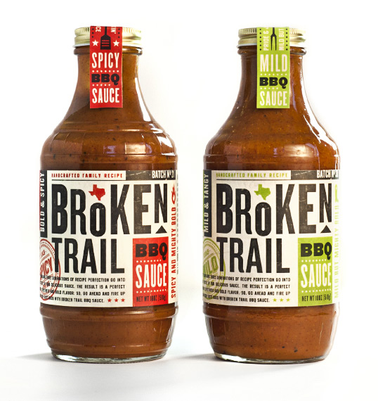
37. Broken Trail Designed by Imaginaria Creative
“Broken Trail Foods, headed by owner Todd Broughton, is a new company just getting into the retail food industry. They came to us to design their first product line, a BBQ sauce so tasty that it would make a New Yorker want to be a Texan. The secret recipe has been perfected by the Broughton family for 50 years. A lot of history and pride go into each bottle, so this was an important element to capture in the design.
The main challenge was creating the look and feel of a down-home Texas BBQ sauce while making the product jump off the shelf amidst all of their competitors. We’re happy to say that these bottles of joy are flying off the shelves and smothering smoked meats across the South.”
38. Sua Maestà Designed by Onthetable
“The goal was to create something really special, luxury and different for a new “Balsamic Vinegar of Modena Condiment”
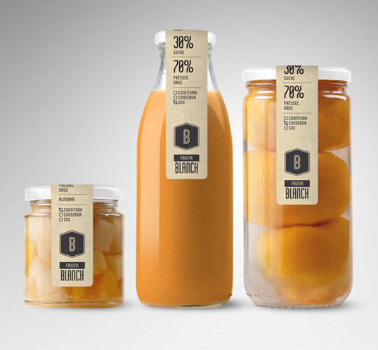
39. Fruita Blanch Designed by Atipus
“Fruita Blanch is a family business with a long tradition. Generation after generation, Fruita Blanch has grown fruit and produced their own jam, preserved products and organic juices.
Fruita Blanch’s new product line is here to let you know about their low-sugar, chemical free preserved products. Produced from 100% organic, self-harvested fruit.
Traditional artisan methods, and the deepest care in what they do, is what defines Fruita Blanch. Gourmet product creations of the future made with the values of the past.
Fruita Blanch has developed a versatile set of multi-sized labels to fit every jar. These labels have been designed to reveal as much of the jar product as well as to emphasize its artisanal nature.”
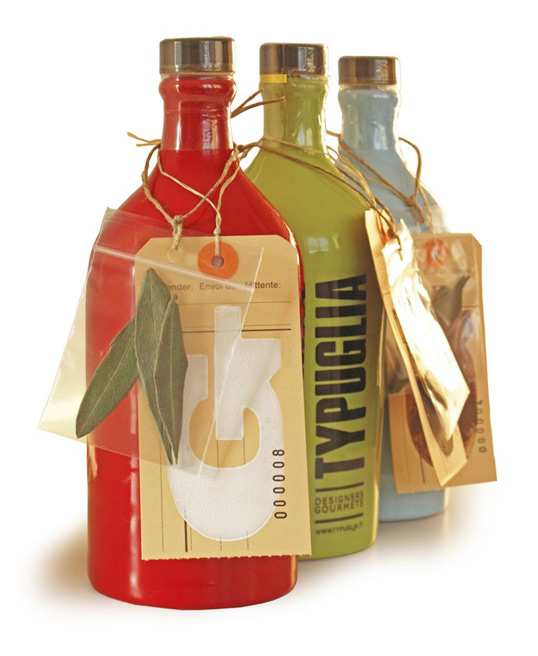
40. Typuglia Designed by Typuglia
This kit especially addresses typography maniacs and gourmets. It’s entirely hand-made and includes: a reusable box, a finely decorated jar containing extra virgin olive oil of certified prime quality, the original wooden type blocks (4 cm high) and a little bag containing the olive leaves the oil was made from.
The tag is hand-stamped through the old printing techniques of mobile wooden types.
All the items in the box are reusable. You can use your creativity and give birth to thousand new products. An example? The box can be used as a table lamp as well as the jar. The wooden font? A fanciful key case.
41. Capriolo Designed by Family(and friends)
“Capriolo is a new, luxury brand of authentic Italian first cold pressed extra virgin olive oil.
A limited edition of less than 850 liters, it’s made from a blend of Frantoio, Leccino and Morello olives from the single estate yield of Podere Casone’s grove in the Umbrian countryside.
The Estate owners approached Family (and friends) to help them create a brand identity and packaging design to launch as a product into the UK market. It will be on sale in up-market food halls and delis from January 2010.
The brief involved finding a name and developing a genuine ‘truth’ for the brand. In an already crowded market of quality oils, impact and ‘storytelling’ needed to be at the forefront of the solution
“We wanted to create a strong story associated with an animal from the region, something that had authenticity and beauty”. Says Alex Durbridge, co founder and creative partner at F&f.
The name Capriolo, Italian for roe deer was chosen with good reason; these elegant creatures roam wild amongst the olive groves, seen fleetingly through the morning mist and acts as a symbol of rarity, freshness and vitality. We used the deer graphically, but it’s antlers have been magically transformed into living olive branches and its eyes have become glossy olives a to create a something of a mythical beast.”
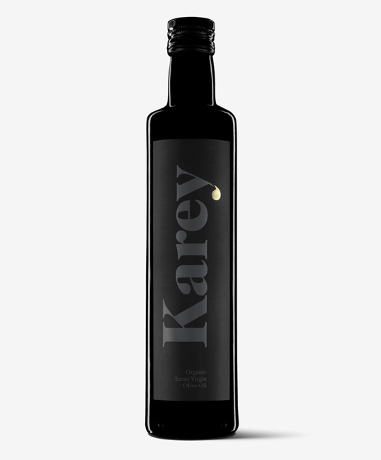
42. Karey Designed by Moruba
“Karey is a organic extra virgin olive oil of excellent quality, for fine restaurants and specialty shops. Its packaging communicates a consistent excellence and delicacy in accordance with the product it contains. The trademark Karey is the main element on the Labeling, a role that is only eclipsed by the typographical wink of the oil tear that is dropped by the letter “y.”
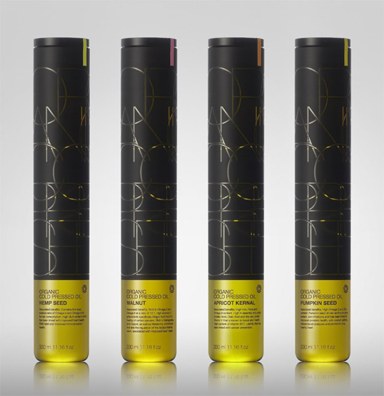
43. Evolve Cold Pressed Oils Designed by SabatogePKG
“SabotagePKG have designed the brand & structural identity for a new range of premium, organic, cold pressed oils by Evolve.
The brief was to create an ecological-premium brand identity which embodies this ethos. Sabotage developed a chic 330ml/11.16fl oz carafe style glass bottle complete with integral lid and pour spout lid. The bottle has been designed with reuse in mind and in this way reducing ecological impact. Oil refills come in a seal fresh pouch.
The base oil range includes Hemp Seed, Walnut, Apricot Kernal & Pumpkin Seed each individually identified by a colour code system.”
44. Student Work Designed by Michael Dibblee
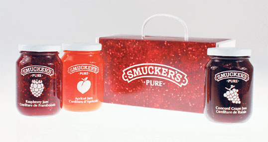
Smucker’s is a North American manufacturer of fruit spreads, ice cream toppings, health and natural foods, beverages, shortening, and natural peanut butter, dating back to 1897. When redesigning a number of products from the Smucker’s Pure Jam line, I intended for the design to truly and uniquely portray the essence of quality and traditions based on the company’s ideals in a new and innovative way.
Ideally, customers should be persuaded to purchase a product by its essence, and not simply by its label. This especially matters when it comes to a company that prides itself on excellent quality. Many consumers have experienced the growing, picking and preparation of fruit for spreads; in remembering the ease at which one can recognize the colours, textures and smells associated with the cooking process of jam, I created a design that emphasizes the jam itself.
After experimenting with die-cuts and windows that exposed the natural colours of the jam, I discovered that reversing this effect actually exposed more of the jam to the consumer. I recreated a silkscreen effect to contrast the rich natural colours of the jam and moved away from traditional label systems used by many competitors. Many rival companies and products embrace the use of photographic and illustrative images of fruits to give the consumer a taste of what the product offers. To break away from this conventional style and allow Smucker’s to stand out when positioned on a grocery shelf, I depicted the fruits as icons. These white icons stand out clearly on the background colours of the jam, yet do not take away from the distinct colours and textures seen through the glass jars.
Overall, the design portrays a rich and elegant aesthetic that stands out from competitors and retains the quality that is associated with the Smucker’s brand.
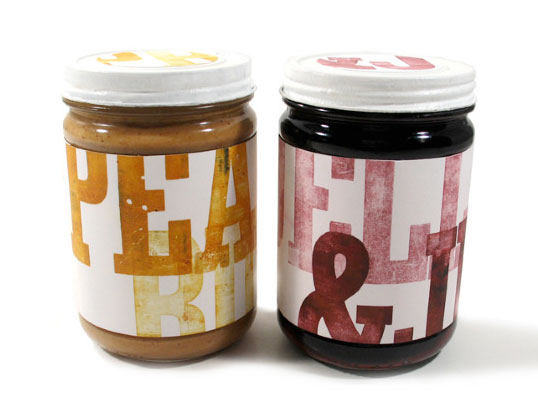
45. Student Work Designed by Jessie Harte
46. Student Work Designed by Kelly Thorn
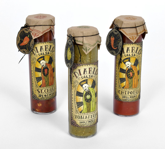
“The assignment was Diablo Salsa and Tortilla packaging, and it had to have a Mexican feel. I decided to use Catholicism in Mexico for inspiration, and found some Patron Saint candles to work off of. This is the final product.”
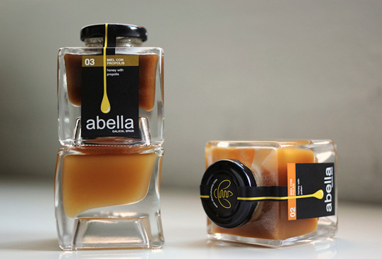
47. Abella Designed by Bonnie Miguel
“Abella is fine artisan honey produced and estate bottled in Galicia, a naturally and historically rich region of northwestern Spain. “Abella” means bee in Gallego, the language spoken in Galicia, and the name is a tribute to these remarkable creatures and the healthy delicacies they produce. The products consist of 100% pure, raw, unfiltered honey created by master beekeepers using age-old techniques. Every drop is a work of art.
The packaging of Abella’s specialty honey line, featuring honey with royal jelly, pollen and propolis, was designed to create an identity for the company and capture the rural, artisan character of the product in a refined, elegant and streamlined manner. The free-form, beveled effect of the jars, from Bruni Glass of Italy, is a natural fit, while the label design makes a simple yet powerful statement.”
48. Jardim D’Oliveira Designed by NTGJ
“Jardim D’Oliveira aims to be not only a simple and modern olive oil but also a part of peoples lifestyle.
It is a delicate DOP Trás-os-Montes 100% organic extra virgin olive oil with a pleasant taste of fresh olives and a beautiful golden color.
Jardim D’Oliveira is a blend of stylish conceptual design and premium quality Portuguese olive oil.”
49. Student Work Designed by Daran Brossard
“Guerro’s Carrots started as a faceless yet tasty jar of pickled vegetables with only an idea for a name. Now, after combining old world flavors with new world presentation, Guerro’s offers the traditional Hispanic kitchen to an American audience in ways they’re familiar with, including a tight identity and refined presentation These spicy carrots have the colorful attitude to match their look: bold and fiery with a hint of cheek, Guerro’s spicy carrots pair well with a light cerveza or chilled tequila—hold the lime.”
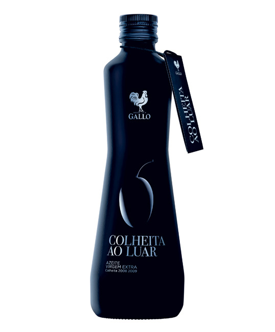
50. Azeite Gallo Colheita ao Luar Designed by RMAC
“From the perspective of the harvest moon, a certain time of the day in which the olives’ qualities are at their peak and give rise to an exceptional quality olive oil, creating a single bottle that can be identified at first glance. A literal approach, which plans to merge in a unique way the night’s darkness (matte black bottle) and the moon’s glowing brightness (silver cover and screen print on the bottle), which illuminates the olives and gives it a very special character.”
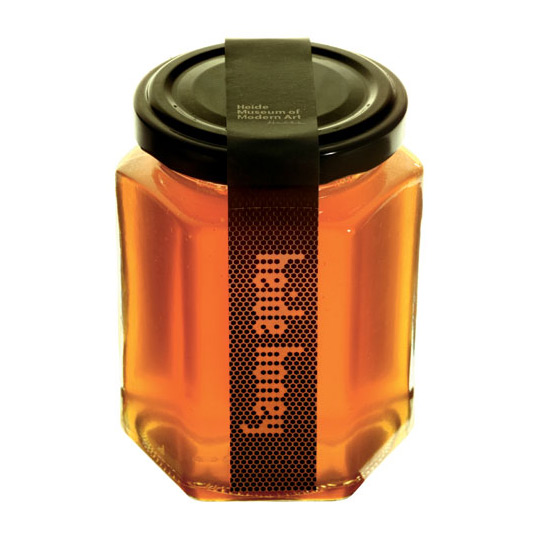
51. Heide Honey Designed by Pidgeon Design
“Heide Museum of Modern Art produces and sells its own honey. The packaging and point-of-sale poster are both based on the Hex typeface developed by David Pidgeon.”
Momentan sunt 1 utilizatori care navighează în acest subiect. (0 membri și 1 vizitatori)
 Permisiuni postare


 Răspunde cu citat


Marcaje